
Oct 8, 2011
The Kerning game

Oct 6, 2011
Anamorphic Typography
- http://www.behance.net/gallery/Anamorphic-Typography/1091883An exploration of the potential and existing relationship between architecture and typography
This project evolved out of a brief we had set ourselves as part of the assessment for our Foundation Degree course at Chelsea College of Art & Design. From initially looking into the existing and possible relationship between graphic design and architecture we discovered the process of anamorphosis as used by the fine artist Felice Varini.
After researching and testing the process in our studio we began to search for an ideal architectural space within our college buildings to execute our installation in. When planning an anamorphic installation is it important to consider that to maximise the fracturing of the design, it is best to try and touch as many plains as possible. We eventually decided to carry out our installation in a corridor of our college (as shown in the images) using the long walls to maximise the distortion of the letterforms. All of our work is site specific and we spend as long as possible discussing a choosing the perfect architectural locations for our works.
We initially chose the phrase "It's more than just print" to challenge the conventional idea that graphic design can only be realised in 2 dimensions (a poster, business card or magazine etc). The phrase is also a comment on the technique as when viewed from the right viewpoint, the design looks as though it is flat on a 2D plain.
For our second installation we chose the phrase “it’s a point of view” as a comment on the process of anamorphosis where the design only becomes fully legible when viewed from a specific point of view. This piece was also a comment on the the subjective nature of good design, given it’s placement in our end of year exhibition featuring works by all of our peers.
Our work encourages the viewer to walk into and around typography, an immersive experience considering that their usual relationship with type would normally be realised on a two dimensional surface be it printed or computerised. Being able to appreciate it physically painted onto walls of buildings which the viewers are used to interacting with every day draws attention to the beauty of typography and at same time highlighting the architectural forms that it adorns.


Oct 4, 2011
Thank a type designer
(once again, thanks Bedirhan :)
What if every designer defaulted to those ubiquitous, standard fonts that we all find stock on our computers? Thank a type designer who doesn’t settle for just “standard” but knows how to choose, create, or modify an existing typeface to be a memorable and expressive brand mark.


Sep 30, 2011
Periodic table of typefaces

Sep 26, 2011
Jun 20, 2011
Type illustration, thanks Bedirhan!
Angus Hyland’s New Book ‘Symbol’ Out Now
http://pentagram.com/en/new/2011/05/new-work-symbol.php
Symbol, edited by Angus Hyland with Steven Bateman and containing an introductory essay by David Gibbs, is published today by Laurence King.
The book features over 1300 symbols, organized into groups and sub-groups according to their visual characteristics. Each category includes a short introduction on who the symbol was designed for, the designer, and in some cases, what the symbol stands for. These sections are interspersed with short case studies on both classic and more recently designed symbols.
Symbol is a comprehensive resource for anyone interested in graphic design. Did you know, for instance, that the CND symbol (Campaign for Nuclear Disarmament), designed by Gerald Holtom in 1958, now universally used to symbolize peace, is built out of semaphore for the letters N and D?
Last week Hyland gave a talk at the Design Museum to a packed crowd to celebrate the launch of the book. The evening was filmed and we will post a link to that film in due course.


Nov 4, 2010
A LESSON ON KERNING
Link to the original article http://chrisbeesley.blogspot.com/2009/07/lesson-in-kerning.html
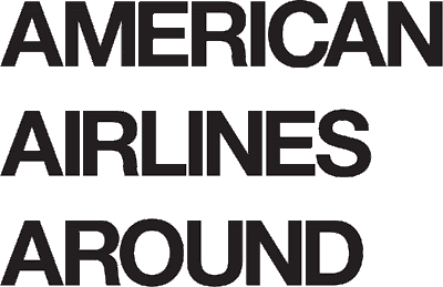
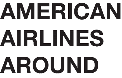
If we were to take three lines of text: AMERICAN, AIRLINES, AROUND and just type it out in Helvetica bold it might look passable but our goal is to fix the spacing so that it doesn't look there are holes of white space in the words.
 Once you have the space between the first two letters established you can kern the rest of the text. This isn't a purely mathematical thing, it's visual. Each letter is unique and the amount of positive and negative space it has is different so you can't rely on using Illustrator to make sure the space is numerically even. The way you do this is by looking at three letters at a time and moving the third letter left or right until it looks like the middle letter is centered between the first and third.

 This looks about right
Consistency Commandments:
Now that we've begun to space the letters there are some guidelines that will make it easier and faster so that you don't have to rethink each pair of letters.
The space between two straights will always be the same.
For example if you have already established the space between "IB" you will know what to do later in a heading if encounter a "NM"

The space between two rounds will always be the sameIf you have already established the space between "OC" you will know what to do when you see "OG"

The space between a straight and a round will always be the same.If you have already established the space between "MO" you will know what to do when you see "HC"

Here is what you might get for a final product if you started off with the "AM" combination above
Aug 10, 2010
Gourmet Typography
~~~~~~~~~~~~~~~~~~~~~~~~~~~~~~~~~~~~~~~~~~
 Once again, Ilene teaches her ever-popular Gourmet Typography class at School of Visual Arts in NYC. Take control of your type instead of letting it control you. Learn the typographic skills and secrets of type experts, including selecting the right typeface, mixing type, techniques for emphasis, fine-tuning your type, kerning and spacing, as well as typographic do’s and don’ts. This course will raise the level of your design and production skills and instill an excitement and passion for typography. Check it out...
Upcoming Typography Workshops & Events
~~~~~~~~~~~~~~~~~~~~~~~~~~~~~~~~~~~~~~~~~~
 Every creative professional, including the most seasoned designer, can benefit from learning to communicate more effectively with type. This workshop will give you the expert-level typographic skills and aesthetics necessary to visibly improve your type. It will sharpen your eye and reignite your passion for typography.
Gourmet Typography
AIGA Orlando
Orlando, Florida
September 17
Type Rules! 3rd edition book signing and talk: 10 Worst Type Crimes
TDC
New York, NY
September 30
TypeTalk: Why Distorting Type Is a Crime
TypeTalk is a regular blog on typography. Post your questions and comments by clicking on the Comments icon above.
Q. Why is stretching or squeezing type in headlines considered a type crime? I occasionally get this request from art directors, clients, and marketing. I know it's considered wrong, but I don’t know how to reply to them.
A. Distorting type in any way, whether it be stretching, squeezing (AKA squishing), or slanting, is a type crime of the highest degree. It distorts the proportions in a way that destroys the integrity of the letter shapes. It can also reduce legibility by creating a fun-house effect.
You can see the effects of artificially condensing a typeface in the Futura example below. It has its own condensed version that maintains pleasing curves and the minimal stroke contrast of the regular version. The computer-scaled version to the far right fails miserably in comparison, with its ugly egg-shaped contours and exaggerated stroke contrast.

Check out the difference between Futura Oblique and the computer-generated slanted version below. The fake slanted version on the right has a more distorted shape, as well as uneven and exaggerated stroke contrast.

Finally, observe the unpleasant result of stretching Univers. The true-drawn extended version, second from the left, looks far better than the two examples of computer stretching on the right.

A way to avoid these requests for artificial distortions is to pick a typeface or type family that contains legitimate, true-drawn width variants. When created by a skillful type designer, a width variant maintains the weight contrast between thick and thins; the relationships of the horizontals and verticals; the axis of the character stress of italics (when applicable); the thickness and integrity of the serifs, if any; the overall width of character; and the spacing.
Don't give in to these requests to "set to fit" or fill in white space! Instead, work with the chosen typefaces and other elements to make a successful composition and overall design.
Love type? Want to know more? Ilene Strizver conducts her acclaimed Gourmet Typography workshops internationally. For more information on attending one or bringing it to your company, organization, or school, go to her site, call The Type Studio at 203-227-5929, or email Ilene at info@thetypestudio.com. Sign up for her e-newsletter at www.thetypestudio.com.
Jun 15, 2010
All Things Typographic
Everything you didn’t know you didn’t know, typographically speaking! -- TypeTalk: You ask, we answer -- Typography for Signage -- Typo Tips from Erik Spiekermann -- Cheese or Font? -- Bring Gourmet Typography to your company, school, or organization -- The Type Studio now on Twitter
| |
| TypeTalk: You ask, we answer ~~~~~~~~~~~~~~~~~~~~~~~~~~~~~~~~~~~~~~~~~~  Q. Is there an optimum column width for text settings that makes the text easier to read? Check it out... Q. Is there an optimum column width for text settings that makes the text easier to read? Check it out...Q. How can I avoid importing the formatting in a Word document when I place the text into a design program? Check it out...
| |
| Typography for Signage ~~~~~~~~~~~~~~~~~~~~~~~~~~~~~~~~~~~~~~~~~~  Signage must make its point as quickly as possible, whether it is promoting a product, providing directions, or previewing a brand. Typography — the right faces used appropriately — holds the key to readability and memorability. Read on... Signage must make its point as quickly as possible, whether it is promoting a product, providing directions, or previewing a brand. Typography — the right faces used appropriately — holds the key to readability and memorability. Read on...
| |
| Typo Tips from Erik Spiekermann ~~~~~~~~~~~~~~~~~~~~~~~~~~~~~~~~~~~~~~~~~~  With the invention of desktop publishing, designers found themselves setting type on their computers for the first time. Until then, they had made type specifications for typesetters and left the job up to the professionals. As a result, you can still see classic inaccuracies in typesetting, even in top-quality printed matter. Here you will find some tips from Erik Spiekermann, co-author of Stop Stealing Sheep, and a FontShop founder, which will prevent some of the more obvious blunders. Read on... With the invention of desktop publishing, designers found themselves setting type on their computers for the first time. Until then, they had made type specifications for typesetters and left the job up to the professionals. As a result, you can still see classic inaccuracies in typesetting, even in top-quality printed matter. Here you will find some tips from Erik Spiekermann, co-author of Stop Stealing Sheep, and a FontShop founder, which will prevent some of the more obvious blunders. Read on...
| |
| Cheese or Font? ~~~~~~~~~~~~~~~~~~~~~~~~~~~~~~~~~~~~~~~~~~  Fonts and cheese — what could they possibly have in common? Perhaps more than you think. Play this fun game and find out how well you really know the difference between these two incongruous items. Check it out... Fonts and cheese — what could they possibly have in common? Perhaps more than you think. Play this fun game and find out how well you really know the difference between these two incongruous items. Check it out...
| |
| Bring Gourmet Typography to your company, school, or organization ~~~~~~~~~~~~~~~~~~~~~~~~~~~~~~~~~~~~~~~~~~  In today’s competitive market, you need all the edge you can get. Whether you are a student or a professional, having strong typographic skills should be at the top of your list. In today’s competitive market, you need all the edge you can get. Whether you are a student or a professional, having strong typographic skills should be at the top of your list.Bring Gourmet Typography Training right to your company, school or organization! Workshops are customized for groups of any size and designed to fit your specific needs. Sessions are scheduled for your convenience — daytime, evenings or weekends. We will design a program customized for your particular requirements. SUMMER DISCOUNT: $300 off workshops scheduled June thru August. SCHOOLS & UNIVERSITIES: Special pricing, call 203.227.5929 for details. “I want to thank you for the great workshop last Friday. You dusted off and reinforced all of those typographic rules that I have — and have not — lived by in all my years as a graphic designer. Your down-to-earth approach to type made the session breezy and fun, and I couldn’t help but visually re-spacing all the headlines I had the time to linger on during my bumper-to-bumper drive back to home. Thanks again for reigniting my spark for type!” For more info, click here or call 203.227.5929.
| |
| The Type Studio now on Twitter ~~~~~~~~~~~~~~~~~~~~~~~~~~~~~~~~~~~~~~~~~~  Yes, I gave in to Twitter pressure. It's no longer your teenager's social networking tool, but a valuable source of education and information for students, educators and professionals of all kinds. Yes, I gave in to Twitter pressure. It's no longer your teenager's social networking tool, but a valuable source of education and information for students, educators and professionals of all kinds.Follow me at Twitter for the best of typographic rants, raves, reviews, and releases. |
May 12, 2010
All Things Typographic 5/10

[Thanks to Ilene Strizver at the Type Studio]
Spring clean your typographic knowledge! -- TypeTalk: You ask, we answer -- Scaling Logos -- Four Techniques for Combining Fonts -- What the iPad is Missing -- Bring Gourmet Typography to your company, school, or organization -- The Type Studio now on Twitter
| |||||||
| |||||||




 Is there a way to know what fonts will work together? Building a palette is an intuitive process, but expanding a typographic duet to three, four, or even five voices can be daunting. Here are four tips for navigating the typographic ocean, all built around H&FJ's Highly Scientific First Principle of Combining Fonts: keep one thing consistent, and let one thing vary.