
(thanks Bedirhan)
Four self-made women who shaped the course and voice of modern graphic design.
 After spending some time in the creative industry, Swedish design duo Hjärta Smärta (“Heart Pain”) observed that there weren’t nearly enough female design role models at the forefront of our cultural awareness. So they started Hall of Femmes, an online project (alas, in Swedish) highlighting female designers and art directors who have significantly influenced creative culture. In 2009, the pair traveled to New York to interview some of these design icons as the basis for a series of books and soon thereafter they published four of these volumes honoring female creative legends.
A few years ago, we traveled to New York to meet up with a few iconic female graphic designers. We wanted to connect with women whose successes we could aspire to. With the book series HoF, we direct attention to these unsung heroines.” ~ Angela and Samira, Hjärta Smärta
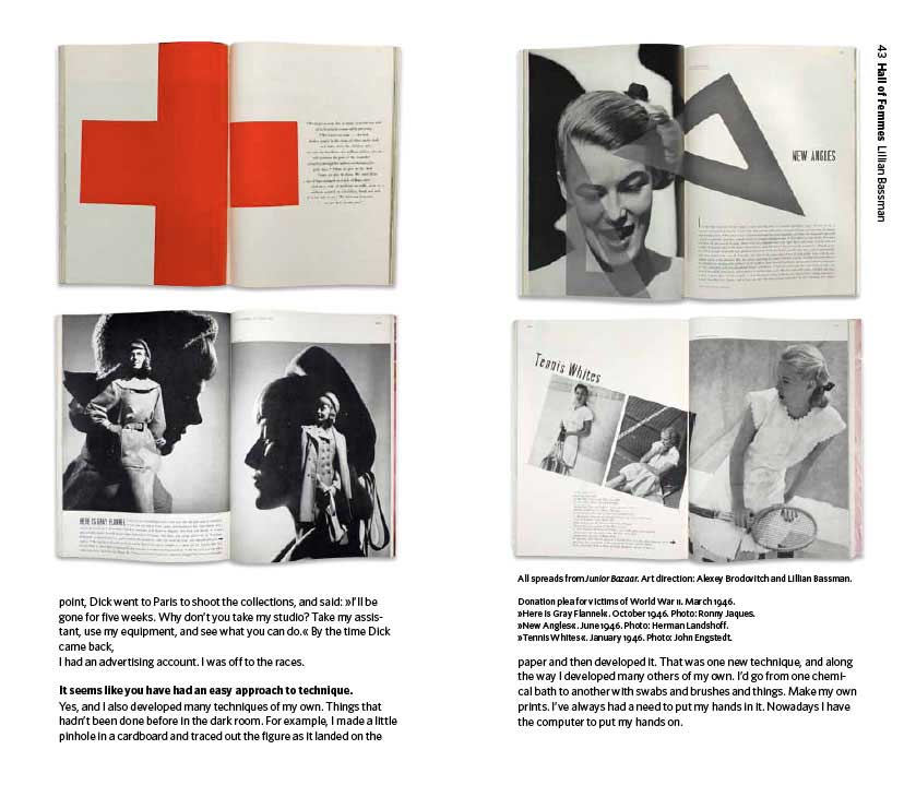
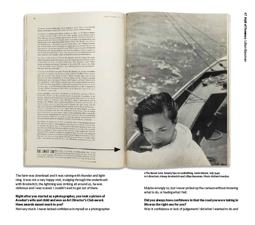
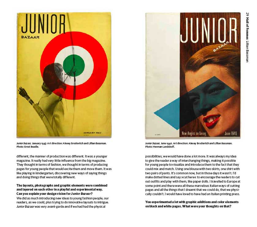
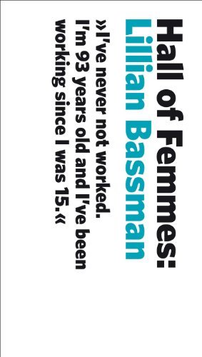 Hall of Femmes: Lillian Bassman tells the story of one of the first art directors, who got her start as an assistant to Alexey Brodovitch at Harper’s Bazaar during the golden age of the American magazines in the late 1940s. In 1945, Bassman became art director for the newly launched Junior Bazaar, a fashion magazine focused on teenagers that functioned as a creative lab for up-and-coming creatives. The magazine folded just three years later, but the creatively agile Bassman taught herself photography and became one of Harper’s Bazaars’ most sought-after photographers. At 94 today, she still works every day.
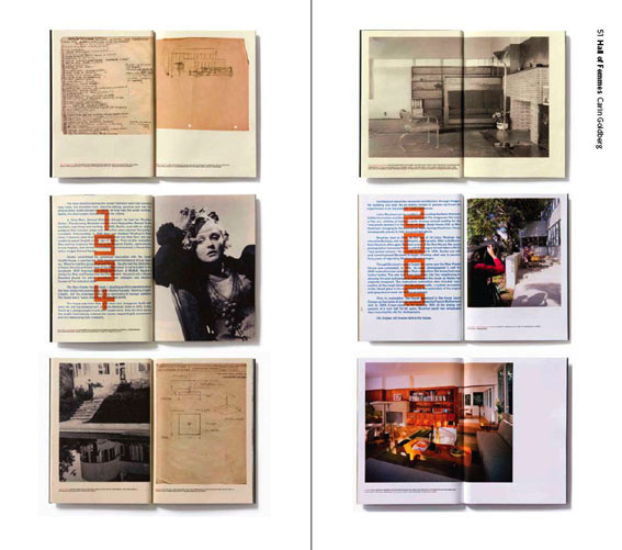
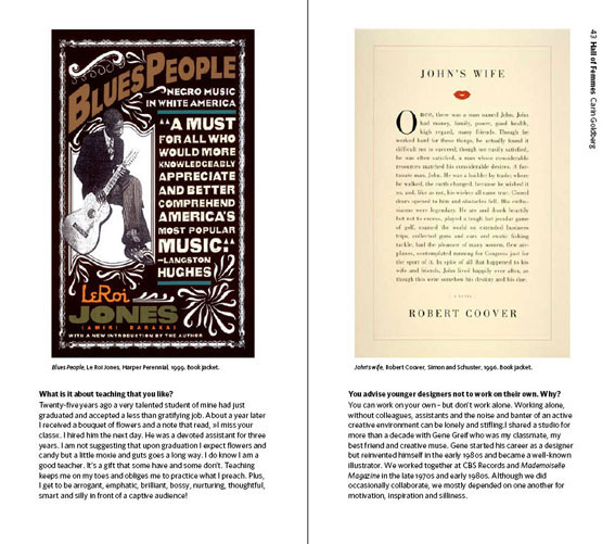
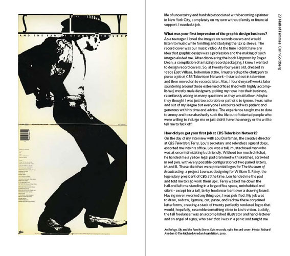
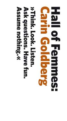 Hall of Femmes: Carin Goldberg highlights the legacy of postmodernist book designer who earned the prestigious AIGA Gold Medal for lifetime achievement in 2009. Her career began in the 1970s as a designer at CBS Television and CBS Records, an era that expected you to be, as Goldberg puts it, “a cool, irreverent, experimental, hungry, talented smart-ass”. In the 1980s, she founded her own firm, Carin Goldberg Design, where she heads to this day. Over the past three decades, Goldberg has designed more than 1000 books for every iconic publishing house and has worked with legends like Madonna and Steve Reich, as well as Brain Pickings favorites Kurt Vonnegut and Susan Sontag.
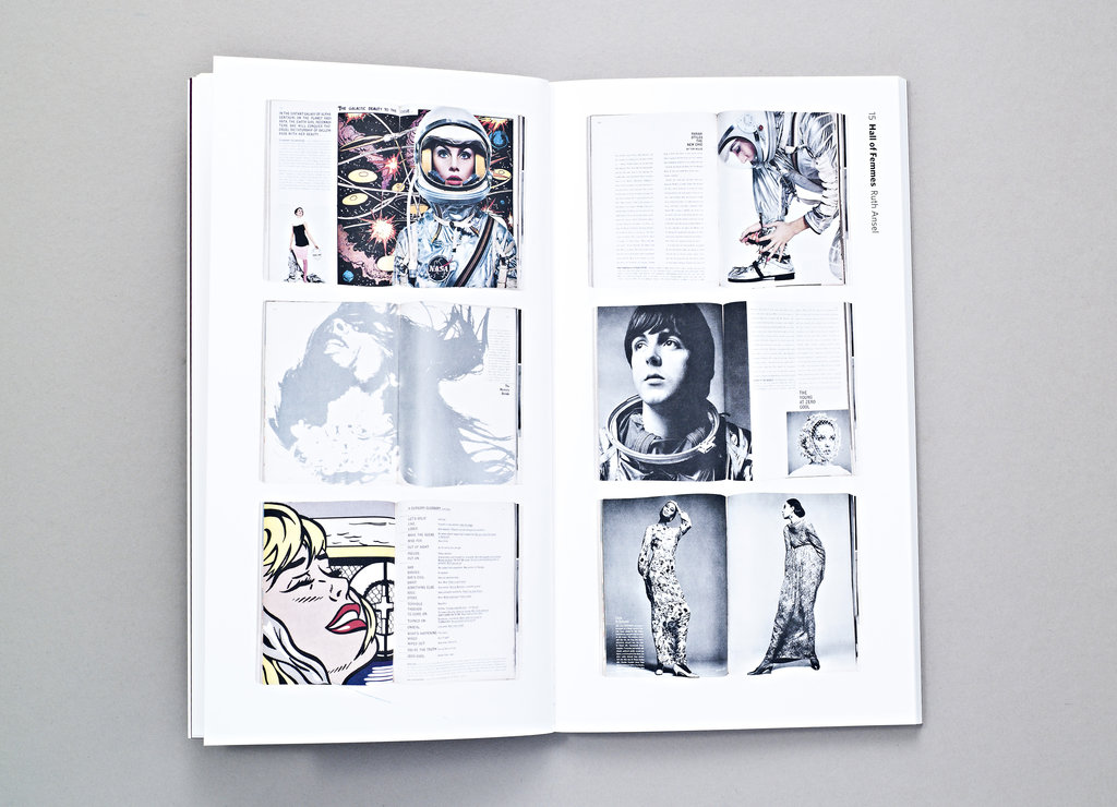
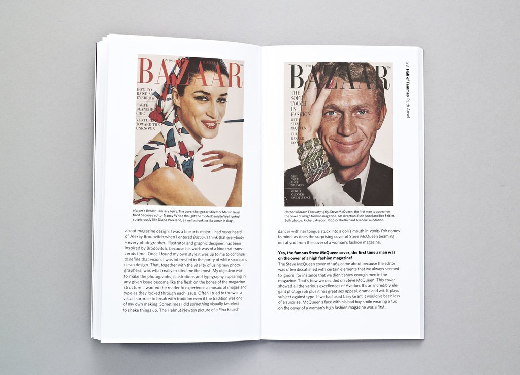
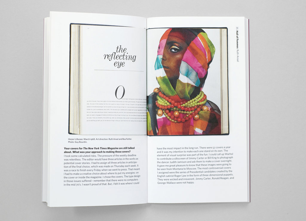
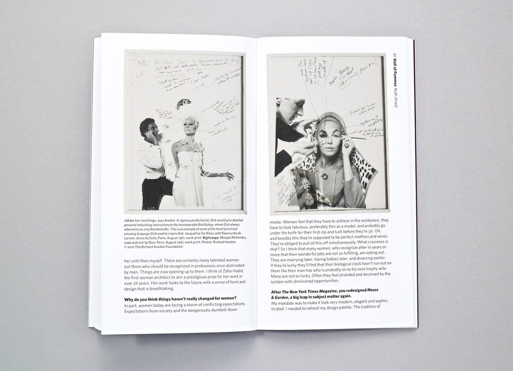
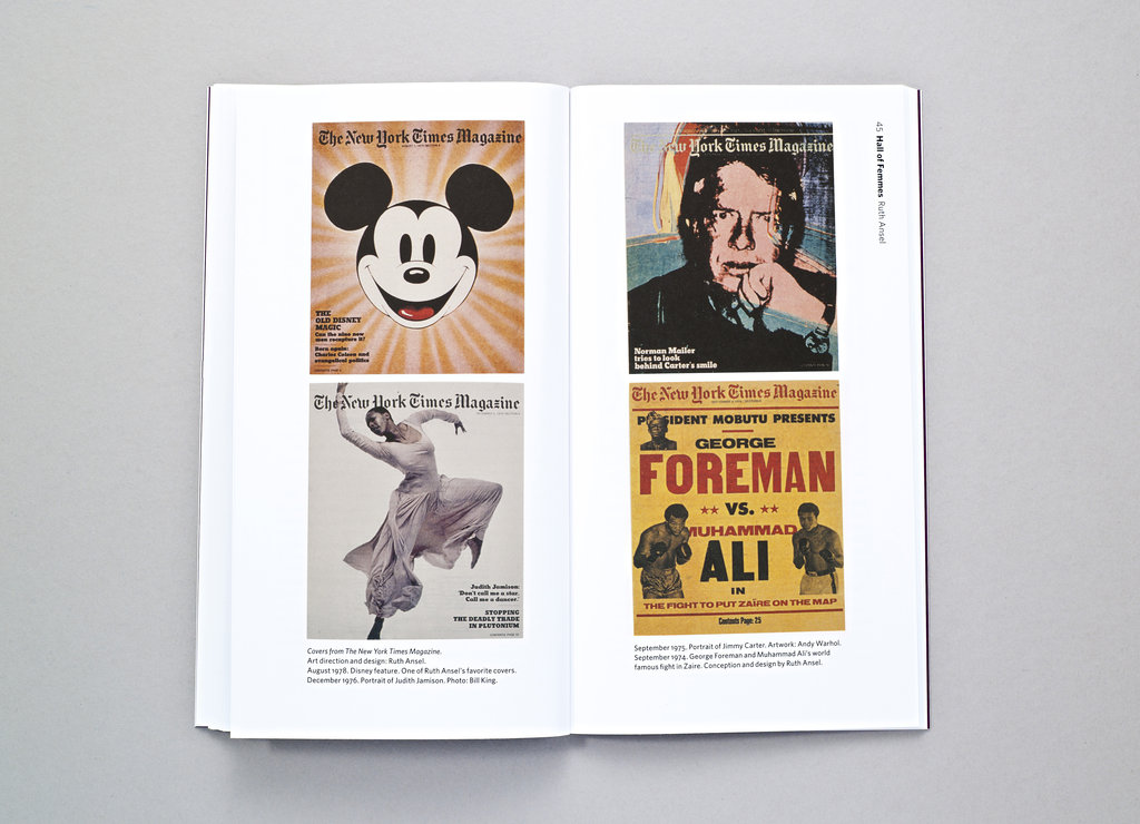
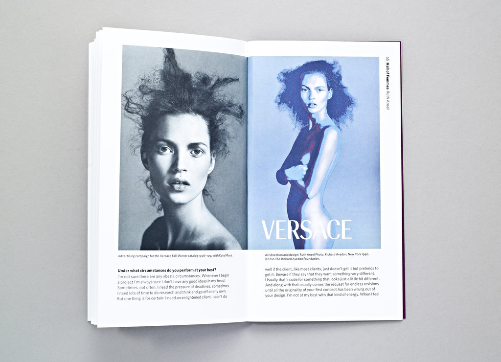
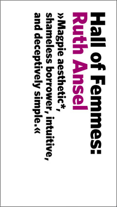 Hall of Femmes: Ruth Ansel highlights one of the greatest magazine designers of all time, who over the past half-century has been shaping the visual aesthetic of some of the most influential magazines of our time as a visionary art director — Harper’s Bazaar in the 1960s, The New York Times Magazine in the 1970s, Vanity Fair in the 1980s, and running her own design studio since the 1990s. She has collaborated with nearly every icon of magazine publishing — Diana Vreeland, Richard Avedon, Annie Leibowitz, Bruce Weber, Tina Brown, and many more.In her 70s, answer remains active and creatively restless as ever.

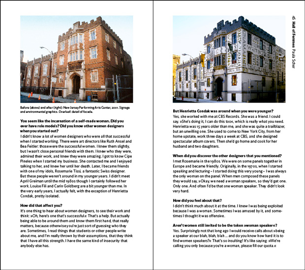
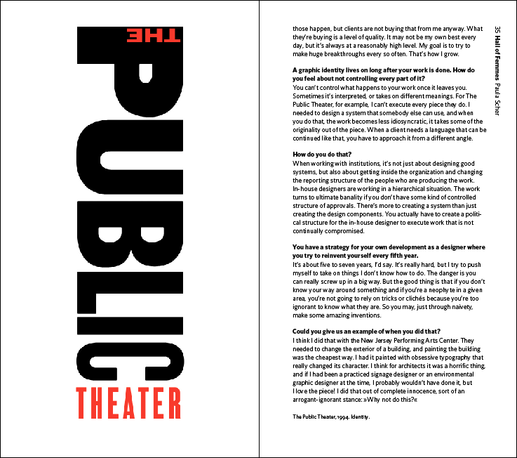
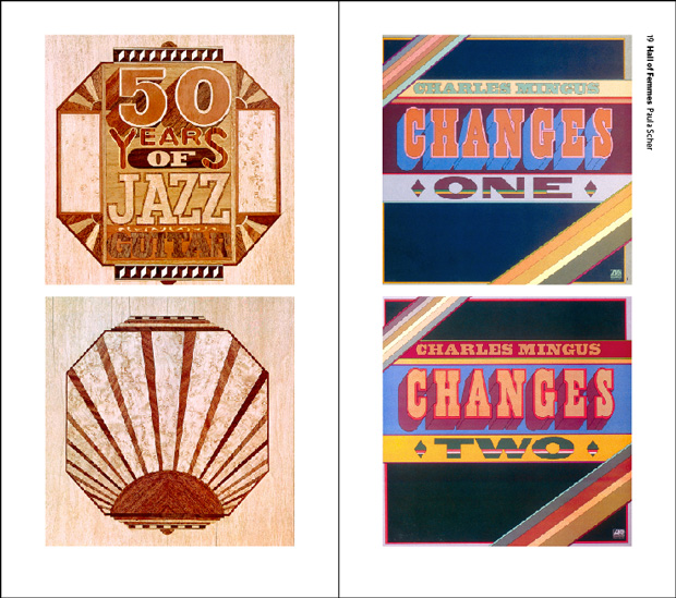
 The most recent in the series, Hall of Femmes: Paula Scher, covers one of my personal heroes, whose views on combinatorial creativity capture the founding ethos of Brain Pickings with remarkable eloquence. Scher began her graphic design career as a rebellious record cover art director at both Atlantic and CBS Records in the 1970s, where her hate for the then-ubiquitous Helvetica led her to create some of the most innovative and memorable typography of all time, which helped define the visual voice of New York City. In 1991, she joined iconic design firm Pentagram as a partner. Her stunning typographic maps have become one of the most celebrated feats of creative cartography. Her identity and branding systems have helped shape iconic cultural institutions and brands like Bloomberg, Coca-Cola, the Metropolitan Opera, the MoMA, and Citi. In 2001, Scher earned the coveted AIGA Medal for her contributions to graphic design. In 2006, she was awarded the Type Directors Club Medal. At 63, Scher remains a principal at Pentagram and teaches at New York’s School of Visual Arts.


