- http://www.behance.net/gallery/Anamorphic-Typography/1091883An exploration of the potential and existing relationship between architecture and typography
This project evolved out of a brief we had set ourselves as part of the assessment for our Foundation Degree course at Chelsea College of Art & Design. From initially looking into the existing and possible relationship between graphic design and architecture we discovered the process of anamorphosis as used by the fine artist Felice Varini.
After researching and testing the process in our studio we began to search for an ideal architectural space within our college buildings to execute our installation in. When planning an anamorphic installation is it important to consider that to maximise the fracturing of the design, it is best to try and touch as many plains as possible. We eventually decided to carry out our installation in a corridor of our college (as shown in the images) using the long walls to maximise the distortion of the letterforms. All of our work is site specific and we spend as long as possible discussing a choosing the perfect architectural locations for our works.
We initially chose the phrase "It's more than just print" to challenge the conventional idea that graphic design can only be realised in 2 dimensions (a poster, business card or magazine etc). The phrase is also a comment on the technique as when viewed from the right viewpoint, the design looks as though it is flat on a 2D plain.
For our second installation we chose the phrase “it’s a point of view” as a comment on the process of anamorphosis where the design only becomes fully legible when viewed from a specific point of view. This piece was also a comment on the the subjective nature of good design, given it’s placement in our end of year exhibition featuring works by all of our peers.
Our work encourages the viewer to walk into and around typography, an immersive experience considering that their usual relationship with type would normally be realised on a two dimensional surface be it printed or computerised. Being able to appreciate it physically painted onto walls of buildings which the viewers are used to interacting with every day draws attention to the beauty of typography and at same time highlighting the architectural forms that it adorns.


Oct 6, 2011
Anamorphic Typography
40 Beautiful Free Fonts For Creating Attractive Typography Headlines
A sweet collection of carefully handpicked high quality free fonts, which are all suitable to be used for creating attractive typography headlines which will attract people’s attention.
A collection of amazing fonts which are suitable and perfect for web design projects as well print based projects. There is a misconception by designers that free fonts are usually cheap looking and cannot be used in order to create a good design, but what designers don’t realise is that there is the odd good free font it just takes time in order to find the perfects ones. This is the exact purpose of this article to be bookmarked by designers and to referred to in the future when working on a design projects where money may be tight and the client can’t afford to splash out on big expensive fonts. This post will be a handy resource for designers searching high quality good free fonts.
1. Kilogram
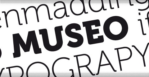
2. Museo
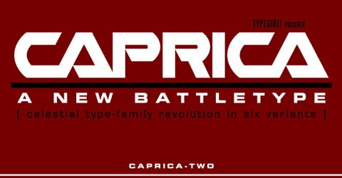
3. Caprica
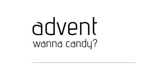
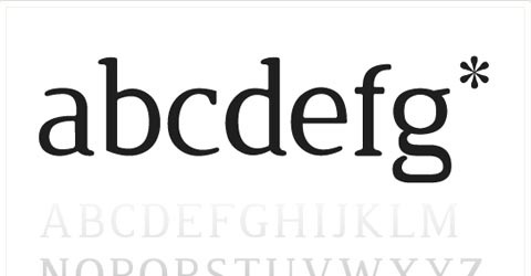
4. Advent
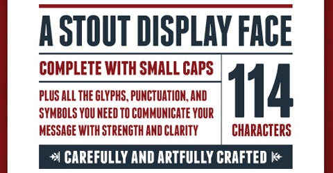
5. Franchise
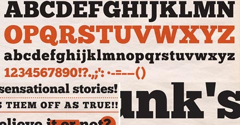
6. Chunk
7. Avant Garde
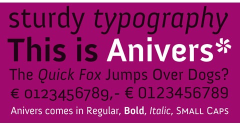
8. Anivers
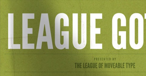
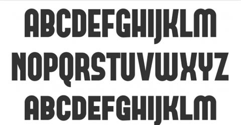
10. Bebas
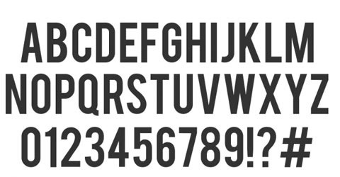
12. attempa
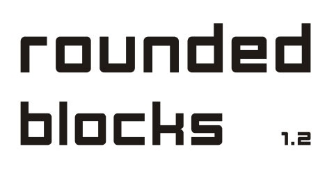
13. Rounded Blocks
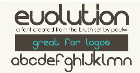
14. Evolution
15. Molot
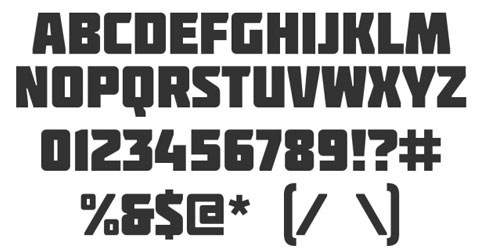
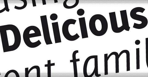
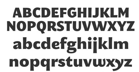
16. Delicious
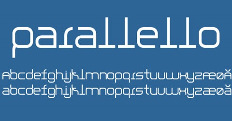
18. Parallello Font
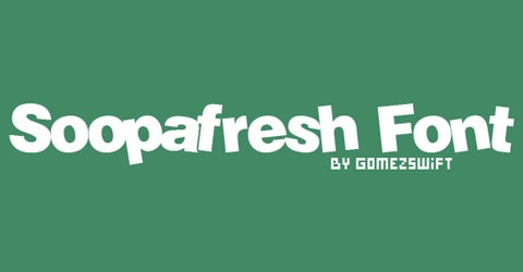
19. Soopafresh
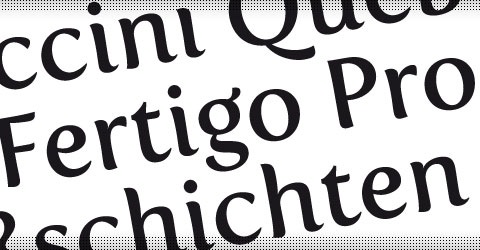
20. Fertigo Pro
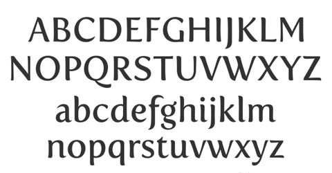
21. Tallys
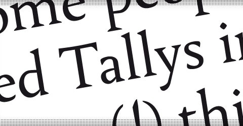
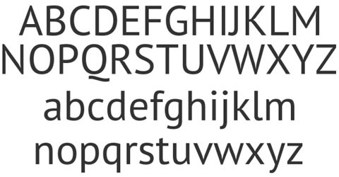
22. PT San
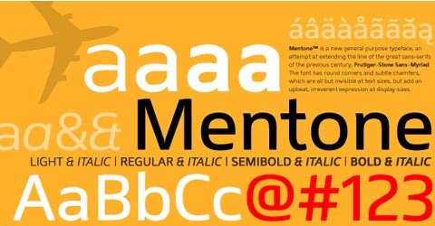
23. Mentone
24. Jura
25. Forque
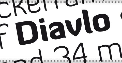
26. Divalo
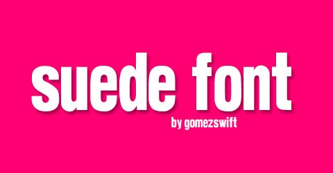
27. Suede Font
28. Gnuolane
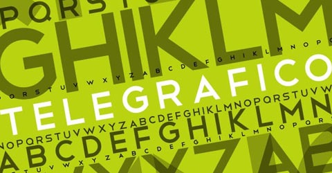
29. Telegrafico
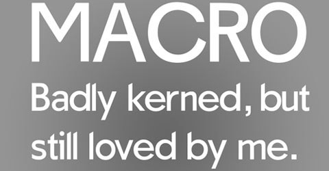
30. Macro
31. Kardon
32. FILE™ free font
33. Otari
34. Fertigo
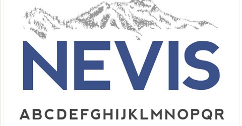
35. Nevis
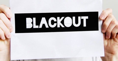
36. Blackout
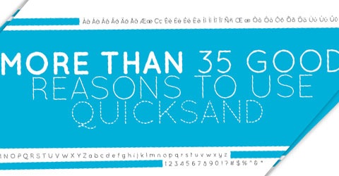
37. Quick Sand
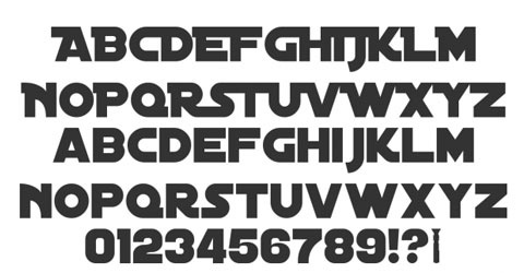
38. Distant Galaxy
39. Cleopatra
40. Rocko

