May 26, 2010

Happy Wednesday: 2 iPad Videos

Wired magazine for iPad and iPad + Velcro. Enjoy. (lust. covet.)


iPad + Velcro from Jesse Rosten on Vimeo.


-e

The Sketchbook Project - 2011

we've posted about the fantastic art house coop before - they organize massive art projects in which anyone all over the world can participate. the final submissions then go on tour and/or are exhibited in the brooklyn art library.

one of their most popular recurring projects is the sketchbook project:

sign up to participate (costs $25) and they will send you a blank moleskin
choose a theme or have them pick one for you:
then fill it in any way you want and send it back!

Each book will be given a barcode so it can be easily cataloged into The Brooklyn Art Library system. Once cataloged, artists will be able to track where on the tour their book is viewed and how many times someone pulled it from the shelf.

you can sign up for the 2011 tour until october 31st, 2010. postmark your book by january 15th, 2011.


see all the details here!

examples of past sketchbooks:


May 24, 2010

Best Made

nice commercial website:

best made company


May 20, 2010

Introducing the Google Font API & Google Font Directory

open source web fonts!

The Google Font Directory provides high-quality web fonts that you can include in your pages using the Google Font API.


Today we are excited to announce a collection of high quality open source web fonts in the Google Font Directory, and the Google Font API to make them available to everybody on the web. For a long time, the web has lagged print and even other electronic media in typographic sophistication. To enjoy the visual richness of diverse fonts, webmasters have resorted to workarounds such as baking text into images. Thanks to browser support for web fonts, this is rapidly changing. Web fonts, enabled by the CSS3 @font-face standard, are hosted in the cloud and sent to browsers as needed.

Google has been working with a number of talented font designers to produce a varied collection of high quality open source fonts for the Google Font Directory. With the Google Font API, using these fonts on your web page is almost as easy as using the standard set of so-called “web-safe” fonts that come installed on most computers.

The Google Font API provides a simple, cross-browser method for using any font in the Google Font Directory on your web page. The fonts have all the advantages of normal text: in addition to being richer visually, text styled in web fonts is still searchable, scales crisply when zoomed, and is accessible to users using screen readers.

read full article here.

May 17, 2010

Call for entries! Poster contest against capital punshiment


DEADLINE: July 18
see details here

CREATIVE BRIEF
We want universal abolition of the death penalty in 2010.
It’s simple. The death penalty is a violation of human rights.
Article 5 of the Universal Declaration of Human Rights states: “No one shall be subjected to torture or to cruel, inhuman or degrading treatment or punishment.”
How does that fit with beheading, stoning, hanging, lethally injecting or shooting someone?
The problem is that there’s no going back on a death sentence. And in a world where every judicial system makes mistakes, it’s inevitable that innocent people will be executed. Which is simply not acceptable. More than two thirds of countries in the world agree, and have banned executions.
Sadly, shamefully, 58 still persist in killing people in the name of “justice.”
In 2009, countries with the highest number of executions were Iran (with at least 388 executions), Iraq (at least 120), Saudi Arabia (at least 69), and the United States (52).
In China information regarding the death penalty remains a secret, but estimates show that China executes more people than the rest of the world combined.*
But there is hope - the number of people being executed around the world appears to be declining. And in December the United Nations will vote on a universal moratorium on the death penalty. It’s a vital step towards abolishing the death penalty once and for all.
No matter whether you live in a country that practices capital punishment or not, we have to raise awareness across the whole world that the death penalty is a violation of human rights that has no place in modern society.

May 13, 2010

Serif Tote Bag

simple, classy, fonty.

yes, please.


from little factory

also! they'll be at designboom mart at ICFF this weekend!

AIGANY EVENT: TYPE FORCAST

FRIDAY 14 MAY 2010 6:30–8:30PM
FRESH DIALOGUE 26: TYPE FORECAST

FRESH DIALOGUE 26: TYPE FORECAST

The future of fonts as we know them is ever-changing. To help prognosticate, we're collecting some of the industry's leaders and asking them to explain what's coming next, why and how it will effect our everyday. We'll touch on lettering, foundries, collectives, technology and applications as well as web, customization and licensing.

Typographers are a rare and specialized breed, so we'll keep an expert moderator on hand to translate and provoke. Questions for the discussion will be taken via Twitter leading up to and during the event. To pose a question, use the hashtag #freshd or address @freshdialogue.

FRESH  DIALOGUE 26: TYPE FORECAST
FRESH DIALOGUE 26: TYPE FORECAST

SPEAKERS

Jessica Hische is a typographer and illustrator working in Brooklyn, New York. After graduating from Tyler School of Art in Philadelphia with a degree in Graphic Design, she worked for Headcase Design before moving to New York to take a position as Senior Designer at Louise Fili Ltd. In September of 2009, after two and a half years of little sleep, lots of gelato, and a ton of hand-lettering, Jessica left Louise Fili Ltd. to pursue her freelance career. She has since started Daily Drop Cap, a year long project that has gained international recognition in which she illustrates an initial cap every (work)day, and also released her first font, Buttermilk, in July of 2009.


Georg Seifert studied at Bauhaus-University Weimar. He works as a software and type designer in Berlin, Germany. His typefaces include Graublau Sans and OliveGreen Mono as well as corporate fonts for clients such as Duravit. For more than four years, Georg has been working on "Glyphs," his own font design application.


Joshua Darden is the founder of Darden Studio, a typeface design studio and consultancy based in Brooklyn, New York. Born and raised in suburban Los Angeles, Joshua published his first typeface at the age of fifteen. He has developed custom typefaces for Latin-based, Cyrillic, and Greek alphabets. He has lectured at the University of California Santa Barbara, has sat on panels at the TypeCon and South by Southwest Interactive conferences, juried the Type Directors Club Type Design Competition, and visited the Rhode Island School of Design as a Guest Critic. Joshua has taught the design and use of typefaces at Parsons School of Design.


MODERATOR


TIME AND PLACE

Friday 14 May 2010
6:30–8:30PM
Tishman Auditorium
66 West 12th Street
New York, NY 10016

REGISTER TODAY

Register in advance for the best rate and to ensure your seat.

$20 AIGA member
$10 AIGA student member
$30 General public
$25 Type Directors Club associate

May 12, 2010

The Activity Book for Type Nerds

I know what i'm getting for my next plane trip...


16 cm x 21 cm / 196 pages / hardback

Hyperactivitypography from A to Z is an activity book for typographers illustrated in a nostalgic vintage style to give it a sweet and childlike look. The book is packed with activities, ranging from silly to hard core nerdiness. It's great to test your skills on and to learn new things while having fun.
Who said typography had to be stiff and boring?


SOLD OUT!
We will give you information as soon as we know if more books will be printed. Stay tuned!

Keep yourself updated at the blog, join the Facebook group
or visit the website of the makers!

Feel free to e-mail Studio3 with questions or feedback :-)

All Things Typographic 5/10


[Thanks to Ilene Strizver at the Type Studio]

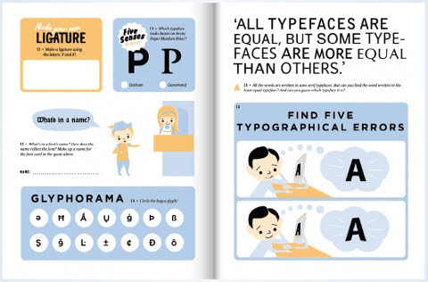
Spring clean your typographic knowledge!
-- TypeTalk: You ask, we answer
-- Scaling Logos
-- Four Techniques for Combining Fonts
-- What the iPad is Missing
-- Bring Gourmet Typography to your company, school, or organization
-- The Type Studio now on Twitter


If this email is not displaying properly, you can view it here. Previous editions can be viewed here.


TypeTalk: You ask, we answer
~~~~~~~~~~~~~~~~~~~~~~~~~~~~~~~~~~~~~~~~~~
TypeTalk Q. It can be overwhelming to choose a typeface from the zillions available online. Do you have suggestions to make the process easier? Check it out...

Q. If a font doesn't include an accented character I need, is there a way to create it? Check it out...


Scaling Logos
~~~~~~~~~~~~~~~~~~~~~~~~~~~~~~~~~~~~~~~~~~
ScalingLogos When it comes to logos, one size doesn't necessarily fit all. A frequently neglected aspect of designing a typographic logo is the potential need for slightly different versions for use at different sizes and in various media. Read on...


Four Techniques for Combining Fonts
~~~~~~~~~~~~~~~~~~~~~~~~~~~~~~~~~~~~~~~~~~
HFJ.Combining Is there a way to know what fonts will work together? Building a palette is an intuitive process, but expanding a typographic duet to three, four, or even five voices can be daunting. Here are four tips for navigating the typographic ocean, all built around H&FJ's Highly Scientific First Principle of Combining Fonts: keep one thing consistent, and let one thing vary. Check it out...


What the iPad is Missing
~~~~~~~~~~~~~~~~~~~~~~~~~~~~~~~~~~~~~~~~~~
FontFeed Has type taken a back seat on Apple's latest entry into the world of digital media? Check out Stephen Coles' take on typography on the iPad. "A device designed for media consumption could validate Apple's dedication to design by emphasizing design's most basic element: typography. But so far, it flops," he says. Check it out...


Bring Gourmet Typography to your company, school, or organization
~~~~~~~~~~~~~~~~~~~~~~~~~~~~~~~~~~~~~~~~~~
Gourmet Typography In today's competitive market, you need all the edge you can get. Whether you are a student or a professional, having strong typographic skills should be at the top of your list.

Bring Gourmet Typography Training right to your company, school or organization! Workshops are customized for groups of any size and designed to fit your specific needs. Sessions are scheduled for your convenience - daytime, evenings or weekends. We will design a program customized for your particular requirements.

SUMMER DISCOUNT: $300 off workshops scheduled June thru August.
SCHOOLS & UNIVERSITIES: Special pricing, call 203.227.5929
Call with FONcall™
Connecting...
Connected!
Error: could not place call
Call with FONcall™
Connecting...
Connected!
Error: could not place call
Call with FONcall™
Connecting...
Connected!
Error: could not place call
for details.


"I found your class to be the missing link in the field of graphic design. I have had type classes before and the content is mostly about the structure of fonts, word usage style and then how to see type as a design element. Very important classes, but not all inclusive. Having been in the field for over 16 years, I was surprised how much I learned and some of the practical information about what to do with fonts. Thanks again!"

For more info, click here or call 203.227.5929.


The Type Studio now on Twitter
~~~~~~~~~~~~~~~~~~~~~~~~~~~~~~~~~~~~~~~~~~
twitterbird Yes, I gave in to Twitter pressure. It's no longer your teenager's social networking tool, but a valuable source of education and information for students, educators and professionals of all kinds.
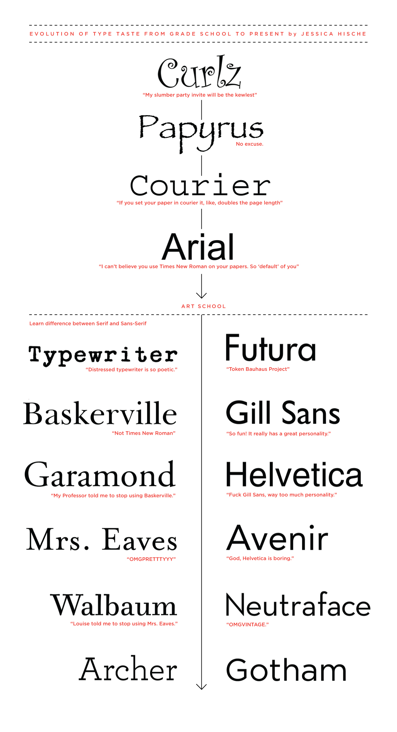
Follow me at Twitter for the best of typographic rants, raves, reviews, and releases.


~~~~~~~~~~~~~~~~~~~~~~~~~~~~~~~~~~~~~~~~~~
~~~~~~~~~~~~~~~~~~~~~~~~~~~~~~~~~~~~~~~~~~


May 7, 2010

Evolution of Type Taste from Grad School to Present

Typographer and illustrator Jessica Hische (of daily drop cap fame, among other things) made a very amusing chart of her evolving tastes in typography.

I think I'm still in her Mrs. Eaves era ("OMGPRETTTYYY")

In other news, Jessica also has a very rad tattoo:

May 6, 2010

Chart your domination

want!


Created exclusively for the Royal We by Oliver Jeffers, this is a signed print of a hand painted map of America. With pins. Each print comes with 102 pins to chart your path to total American domination. 100 of the pins are orange, one of them is red and one of them is blue. Orange is for states conquered, red is for headquarters and blue is for state of origin.