InDesignSecrets.com
Resource for all things InDesign.
Lynda.com
Software training online tutorials for Adobe, Microsoft, Apple and more.
FontFeed.com
Improve your typography skills with these basic tips and advanced tutorials.
computerarts.co.uk/tutorials
Computer Arts Tutorials
a.

Jul 9, 2010


Jul 8, 2010
Jul 6, 2010
Type Specimen - Jan Tschichold


Jan Tschichold's type specimen
images taken from amassblog.com which is curated by James Phillips Williams
Williams posted these images on his blog along with the story behind it.
Evidently, while still a student at Yale School of Art he became friends with one of his professors, Paul Rand. Rand and Williams both collected all things written and designed by Jan Tschichold. One day Paul Rand shared this specimen with Williams only in the end he revealed the inside front cover and the ex libris indicating that the specimen had belonged to Tschichold himself. Then he gave the specimen to Williams.
Many thanks to JP Williams for sharing this specimen and the story behind it with us. To read more, go to amassblog.
a.



Jul 2, 2010
Assignment #2
You need to create a PSA (public service announcement) in a form of a poster. You have to create a series of three posters which can be developed into a campaign later on if you wish.
The topic is open to anything that interests you. Pick something that hasn't been played out before i.e. "Don't kill whales", "People against oil spill", etc. If you are passionate about a big topic like that, you run a risk of competing with a big crowd of people.
An additonal part of this project is development of some merchandise that can go along with the campaign, such as: t-shirts, hats, badges, stickers, mugs, etc.
For this project you are allowed to use your type skills and incorporate color and graphics.
HAVE FUN!!!
The topic is open to anything that interests you. Pick something that hasn't been played out before i.e. "Don't kill whales", "People against oil spill", etc. If you are passionate about a big topic like that, you run a risk of competing with a big crowd of people.
An additonal part of this project is development of some merchandise that can go along with the campaign, such as: t-shirts, hats, badges, stickers, mugs, etc.
For this project you are allowed to use your type skills and incorporate color and graphics.
HAVE FUN!!!
Jun 30, 2010
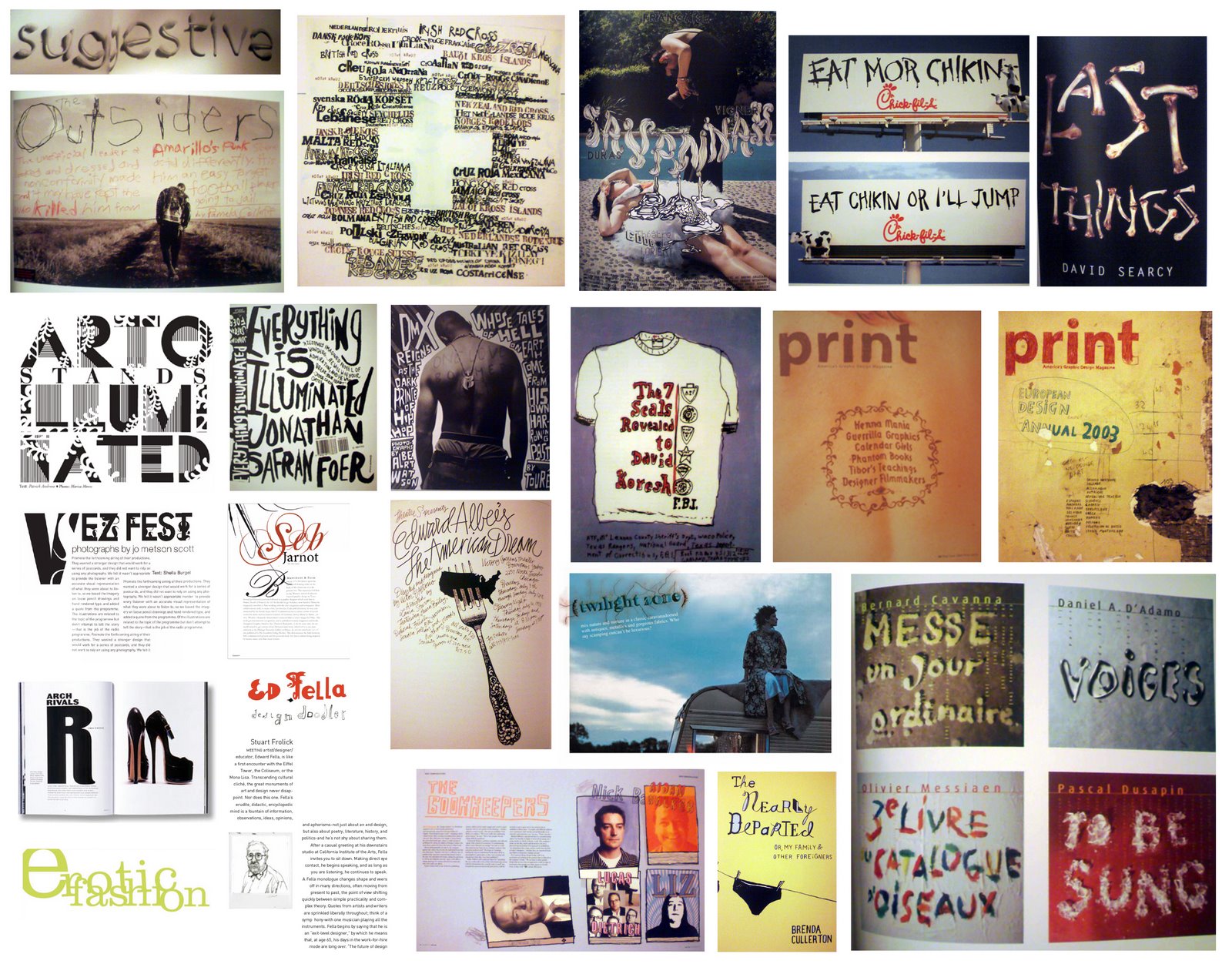
YUMMY SWIPE for those of you who are still working on the type specimens
Here's some swipe I thought you guys might find useful and inspirational.
The owner of this beauty is Alexey Brodovich. Look him up if you're interested in his style.


The owner of this beauty is Alexey Brodovich. Look him up if you're interested in his style.


Bookbinding resources
Here's 2 great places where you'll be able to find everything on bookbinding:
http://www.talasonline.com/

http://www.centerforbookarts.org/
http://www.talasonline.com/

http://www.centerforbookarts.org/

List of ideas for the next project:
BLOCK PARTY
BIKE-KILL
LOCAL FILM FESTIVAL
BIG APPLE FESTIVAL
SMOKE-UP DAY AT WASHINGTON SQ. PARK
ARTS AND CRAFTS SALE
STOOP SALE
YARD SALE
LOCAL DANCE COMPANY
LOCAL MUSIC FESTIVAL
LIBRARY BOOK SALE
UNION SQUARE PARK HAPPENINGS
5 BOROUGH BIKE TOUR
The subject is open and if anyone has anymore ideas they want to share, let me know.
BIKE-KILL
LOCAL FILM FESTIVAL
BIG APPLE FESTIVAL
SMOKE-UP DAY AT WASHINGTON SQ. PARK
ARTS AND CRAFTS SALE
STOOP SALE
YARD SALE
LOCAL DANCE COMPANY
LOCAL MUSIC FESTIVAL
LIBRARY BOOK SALE
UNION SQUARE PARK HAPPENINGS
5 BOROUGH BIKE TOUR
The subject is open and if anyone has anymore ideas they want to share, let me know.
Jun 29, 2010
THE SLOW MOTION SHOW
Hey ya'll Genevieve and I were thinking of taking a trip to this awesome show/event next week during the class. We'll take it back to class in time for the crit. What do you guys think?
http://www.facebook.com/event.php?eid=130886960268091
The Slow Motion Show Opening Night Event!
| Date: | Tuesday, July 6, 2010 |
| Time: | 6:00pm - 8:00pm |
| Location: | Visual Arts Gallery |
| Street: | 601 West 26 St. (between 11th Ave & West Side hwy) |
| City/Town: | New York, NY |
The Slow Motion Show is a thesis collaboration between three design students:
Kirstin Huber, Louis Liu and Kevin Wang.
The show contains several self-curated, self-produced art pieces.
Please join us for the opening night event of our thesis show! We've been working on this for almost a year and now all of our hard work (and your help!) is about to pay off!
The Slow Motion Show is a synthesis of different points of view and forms of design thinking. The content of the show interprets slow motion as a device used to reveal the unnoticed. The purpose of this show is to present a broader viewpoint of simple moments, in order to better understand their importance.
The pieces in the show range in medium--from video projections, to hand-written letters, to performance art. We've revealed some interesting interpretations of "slow motion" in an unexpected way.
If you can't make it to the spectacular opening night event--your loss--but the show will be up until August 14, so please stop by the next time you're out in Chelsea!
Thanks again to everyone who contributed to our Kickstarter to help make this event possible! ♥
----- [[ UPDATE ]] -----
Website for The Slow Motion Show has officially been launched!
http://welikeitslow.com/
10 Kisses Of Death for a Resume
10 Kisses Of Death for a Resume
Resume writing mistakes that ruin your chances
Listen. Is that your phone not ringing? And after sending out 100 resumes, each of them four pages long, powder puffed, enveloped in coral green and sealed with a wax stamp? Maybe it’s time to take stock of that all-important document, and make sure it’s not stumbling around out there with its figurative foot in its mouth. Here’s 10 kisses of death, classic mistakes made in writing a job resume that have been known to keep phones from ringing.
1) Missing Contact Information
You’d be surprised how many people leave off their phone number on a job resume, or ignore the opportunity to include an email address in the heading. And on that latter point, make sure your email address is stable, long term, and professional sounding. Skip the one you use with your friends, PartyGirl@loadsofun.com, and opt instead for something that won’t raise eyebrows.
2) Too Long
If your job resume is over two pages, you’d better be a world-class CEO with instant name recognition. Then again, if you meet that description, you can get by with a single page, can’t you? Regardless of your real or imagined worth to a company, limit your job resume to two pages max, one page ideally. With regards to all the valuable ‘stuff’ you’re leaving off the job resume, be happy you’ll have something to talk about during the interview.
3) Over The Top Design
Ignore your impulse to write a white-text job resume on black paper, or include a scratch-and-sniff perfume spot on the page. Limit your font selection to one or two. Use the traditional and popular New Times Roman if you prefer lettering with a serif, or consider Arial, Helvetica or Verdana if you want a clean, more modern san serif font. Go easy on the bold and the underlining. And limit your paper selection to white or beige with a weight of 22 or 24 lb. Black type.
3) Misspellings; Poor Grammar
Nothing signals an inattention to detail like a misspelled word on a resume. The job resume, the one document on which you intent to present yourself to your ideal company, and you’ve misspelled achievemints. Well, you won’t be adding to your list of achievemints with that company.
4) A Photo on a Job Resume
Never, never, never include a photo on your job resume–unless you’re applying for a job in Germany, or as a fashion model. U.S. companies outside of the modeling industry will trash your resume immediately to avoid any future accusations that they might have discriminated in a hiring decision.
5) Personal Information Not Relevant To The Job
You may be the Friday Night Dart Champion at Willie’s Bar, but leave it off the job resume. Likewise don’t mention your marital status, number of children if any, social security number, height and weight, hobbies, and sports–unless you’re an avid golfer applying to Titleist.
6) Missing Dates, Missing Employment Information
The hiring official doesn’t like to be left guessing how you acquired your superhuman talents, or where you acquired them, or when. If he is left guessing, you’ll be left guessing why you never get a response.
7) Hard To Read
Long, dense paragraphs are tough slogging. Make use of bulleted points. Don’t crowd your information. Weed out extraneous details and know what employers are looking for–which leads to the next point.
8) A Focus On Job Descriptions vs Accomplishment
It’s implied that a job in outside sales involves calling on customers and following leads. Don’t waste space and readers’ patience spelling that out in minute detail. Rather, get on with the actual accomplishments from the job. Increased territory sales 20% the first year. Initiated order bundling system saving $40K annually in transportation costs. You get the idea.
9) One Too Many Weasel Words
Weasel words are adjectives or action verbs that sound impressive as you’re typing them (extraordinary communication skills, vitally participated in conference XYZ, demonstrated ability to extricate donut from bag with minimal disturbance to icing) but to the trained eye (i.e., the eye of the hiring official) they are indicative of a desperate fellow scrapping the bottom of the barrel for anything positive to say about his time spent at Acme Wingnuts.
10) Functional Resume
Many hiring officials have come to associate the functional format with a candidate seeking to hide some aspect of his work history. And for good reason–many are trying to do just that; hiding gaps in their work history, hiding too many jobs in too short of time.
While it can still be an effective resume, know that choosing a functional format will send up a red flag in the eyes of many employers, something your resume will have to overcome from the get go.
Jun 28, 2010
BOOK COVER DESIGN CONTEST No.4
 This Way for the Gas, Ladies and Gentlemen
PURPOSE
The purpose of the contest is to foster interest in the relationship of literature to the visual arts through the design of a hypothetical book cover for Tadeusz Borowski’s remarkable collection of concentration camp stories This Way for the Gas, Ladies and Gentlemen. This is an ideas competition only: as of this writing there are no plans for the winner’s work to be featured on a forthcoming edition of Borowski’s work.
ELIGIBILITY
This international competition is open to anyone 18 years or older. Graphic design students and professionals are especially encouraged to enter. ONLY ONE ENTRY PER PERSON IS ALLOWED.
DEADLINE
Entries must be received by Friday, July 30, 2010.
See competition details here.
a.
Kerning Type
 KERNING
The term kerning refers to adjusting the space between two letters. If letters in a typeface are spaced too uniformly, they make a pattern that doesn’t look uniform enough. Gaps occur, for example, around letters whose forms angle outward or frame an open space (W, Y, V, T, L). In metal type, a kerned letter extends past the lead slug that supports it, allowing two letters to sit more closely together. In the digital typefaces used today, the space between letters is controlled by a table of kerning pairs, which specify spaces between different letter combinations.
KERNING LARGER SIZES
Because the space between characters expands as the type size increases, designers often fine-tune letterspacing when working with large letters. As the word “rub” gets bigger, the gap between u and b grows more obvious.
via thinking with type
a.
Jun 26, 2010
Assignment
Finish up your type specimens.
GUIDELINES
Make sure you kerned every display type properly. Hyphenate text blocks. Take your design to the next level. Add color or image or both. Think about the binding. Think about the pacing of the signature. Try to make it as exciting as possible. Print and bring to class.
Think about 4 assignments you would like to do in addition to your type specimen and your personal id.
We understand that most of you want to design good portfolio work. So suit your work to your particular job interest. research the firms you'd like to work at and look through their works. You'd want to show your design/type skills along with your conceptual thinking skills and let them see how your mind works.
Here are a few examples:
Research your topic well.
Identify and speak to your target audience when designing.
Post everything on your blog.
a.
GUIDELINES
Make sure you kerned every display type properly. Hyphenate text blocks. Take your design to the next level. Add color or image or both. Think about the binding. Think about the pacing of the signature. Try to make it as exciting as possible. Print and bring to class.
Think about 4 assignments you would like to do in addition to your type specimen and your personal id.
We understand that most of you want to design good portfolio work. So suit your work to your particular job interest. research the firms you'd like to work at and look through their works. You'd want to show your design/type skills along with your conceptual thinking skills and let them see how your mind works.
Here are a few examples:
- Set of 4 PSA (public service announcement) posters.
- Entire book or set of 3-4 mini books.
- Book jacket
- Magazine layouts
- Corporate id
- Business card/website
- Packaging design (CDs, sauces, wine,toılet paper, etc)
- Skateboards
- T-shirts
- Store id
Research your topic well.
Identify and speak to your target audience when designing.
Post everything on your blog.
a.
Jun 23, 2010
Chip Kidd short talk
*The Scholastic Design Forum Presents*
“The Closest Thing to a Rock Star in Graphic Design Today” – /USA// Today/
*Chip Kidd*
Wednesday, June 23 @ 3 PM
The Scholastic Auditorium
557 Broadway
Chip Kidd, top Knopf book designer will appear in the Scholastic Auditorium and will give a short talk, then an exhibit, and reception afterwards. Past lecturers included Milton Glaser, Steven Heller, Ellen Lupton, Richard Wilde, and Maurice Sendak.
Admission is free.
“The Closest Thing to a Rock Star in Graphic Design Today” – /USA// Today/
*Chip Kidd*
Wednesday, June 23 @ 3 PM
The Scholastic Auditorium
557 Broadway
Chip Kidd, top Knopf book designer will appear in the Scholastic Auditorium and will give a short talk, then an exhibit, and reception afterwards. Past lecturers included Milton Glaser, Steven Heller, Ellen Lupton, Richard Wilde, and Maurice Sendak.
Admission is free.
Jun 18, 2010
Jonathan Hoefler & Steven Heller On “Please Explain: Typography”
Leonard Lopate Please Explain: Typography
WNYC 93.9 FM and AM 820 are New York’s flagship public radio stations, broadcasting the finest programs from National Public Radio and Public Radio International, as well as a wide range of award-winning local programming.
Every Friday afternoon Please Explain – the weekly feature on The Leonard Lopate Show – gets to the bottom of one complex issue. The latest Please Explain is all about typefaces and typography. Typeface designer Jonathan Hoefler, type designer and president of Hoefler & Frere-Jones and Steven Heller, co-chair of the MFA Designer as Author program at the School of Visual Arts and author of the VISUALS column for the New York Times Book Review, explain how typefaces are created and why typography is important to communication and design.





Type Styles Abbreviations
Overview of common type styles abbreviations:
Rm | Roman
It | Italic
Obl | Oblique
Sl | Slanted
Th | Thin
Lt | Light
Rg | Regular
Nr | Normal
Bk | Book
Md | Medium
Dm | Demi Bold
Sm | Semi Bold
Hv | Heavy
Bd | Bold
Blk | Black
Ex, X | Extra
Ult | Ultra
Cond | Condensed
Nar | Narrow
Wide
Ext | Extended
via FontFeed by Yves Peters , "Styles, Weights, Widths".
Read other articles on FontFeed-- a daily dispatch of recommended fonts, typography techniques, and inspirational examples of digital type at work in the real world.
a.


Subscribe to:
Posts (Atom)